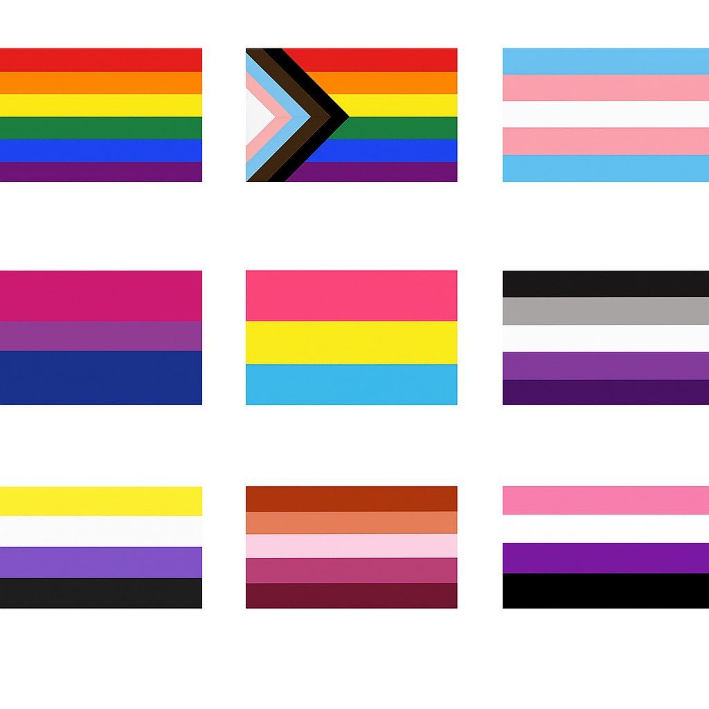
9 Queer Flags You Should Know 🏳️🌈
9 Queer Flags & Their Fab Stories 🏳️🌈
Queer people have always found ways to say, “We’re here, we’re proud, and we’re not going anywhere.” From the days of coded handkerchiefs to rainbow-covered city blocks, flags have become one of the loudest, boldest declarations of identity.
Each queer flag tells a story — not just of color, but of courage. These banners were born from resistance, creativity, and the undeniable need to be seen. So, whether you’re exploring your own identity or brushing up for Pride trivia night, here are 9 queer flags with the most fascinating backstories.
1. Rainbow Flag — The Revolution in Color
Long before rainbow merch filled Target aisles, artist Gilbert Baker stitched the first Pride flag by hand in 1978. Commissioned by Harvey Milk, it flew high in San Francisco’s Gay Freedom Day Parade. The original version had eight stripes, each with meaning:
Hot pink: sex
Red: life
Orange: healing
Yellow: sunlight
Green: nature
Turquoise: magic
Indigo: serenity
Violet: spirit
Due to fabric shortages (and capitalism being capitalism), pink and turquoise were dropped. What remained became the iconic six-stripe rainbow we know today.
💬 Cultural echo: The flag’s first wave marked a visual declaration of queer joy — a radical act when being out was dangerous.
2. Progress Pride Flag — The Inclusive Remix
Fast-forward to 2018: designer Daniel Quasar looked at the rainbow and saw room for growth. The Progress Pride Flag added black and brown stripes to represent queer people of color, and pink, blue, and white from the transgender flag.
The triangle shape? It’s not just aesthetic — it points forward, symbolizing progress while acknowledging the work still to be done.
🌈 Cultural impact: Today, you’ll see this version on global Pride stages, political buildings, and even emojis — a modern emblem of inclusion.
3. Transgender Flag — Pastels with Power
Monica Helms, a transgender activist and Navy veteran, designed the flag in 1999. Its soft pastels carry strong messages:
Blue: traditional for boys
Pink: traditional for girls
White: for those transitioning or identifying outside gender norms
Helms wanted it to be symmetrical — so no matter which way it flies, it’s always correct, representing the naturalness of gender diversity.
💡 Fun fact: The original flag is preserved in the Smithsonian National Museum of American History — official queer heritage, baby!
 4. Bisexual Flag — The Invisible No More
Created in 1998 by Michael Page, this flag fought bisexual invisibility. Its message was clear: bisexuals aren’t “half gay” or “half straight” — they’re their own proud identity.
Pink: attraction to same gender
Blue: attraction to different genders
Purple: the overlap — attraction beyond binaries
💜 Did you know? Page took inspiration from an older symbol, the “biangles” — two overlapping triangles used in the 1990s. This modernized design gave bi pride a much-needed visual identity.
 5. Pansexual Flag — Love Beyond Labels
The pansexual flag emerged online around 2010, born from internet forums and Tumblr threads. Pan people wanted a symbol that wasn’t mistaken for bisexuality.
Pink: attraction to women
Blue: attraction to men
Yellow: attraction to everyone beyond gender
💛 Modern vibe: It reflects how attraction can transcend the gender spectrum — love in high definition. It’s also one of the most internet-famous queer flags, spreading through memes, TikToks, and fan art faster than glitter at Pride.
6. Asexual Flag — No Spark Needed
In 2010, members of the Asexual Visibility and Education Network (AVEN) voted on what would become the ace flag.
Black: asexuality
Gray: gray-asexuality and demisexuality
White: allies
Purple: community
🖤 Cool fact: The asexual flag is one of the few created entirely online by community consensus — no single designer, just collective pride. It reminds us that asexuality isn’t about a lack of something; it’s a valid and vibrant identity.
7. Nonbinary Flag — Designed for the Undefined
At just 17 years old, Kye Rowan crafted the nonbinary flag in 2014 because the genderqueer flag didn’t represent everyone.
Yellow: outside the binary
White: many genders
Purple: a mix of male and female
Black: no gender
💛 Youth power: Kye’s design quickly spread across social media, proving that the next generation of queer creators was ready to color outside every line.
 8. Lesbian Flag — Shades of Sapphic Pride
The lesbian flag has gone through more glow-ups than a TikTok influencer. Early versions included the “lipstick lesbian” flag with a kiss mark, but it didn’t represent everyone. In 2018, a softer orange-to-pink gradient took over — inclusive, community-built, and gorgeous.
🧡 Each stripe has meaning: gender nonconformity, independence, community, love, serenity, and femininity.
💋 Story vibe: It’s a flag by lesbians, for lesbians — a sunset-hued celebration of sapphic love in all its forms.
 9. Genderfluid Flag — A Moving Masterpiece
In 2012, JJ Poole designed a flag that moves as freely as gender does.
-
Pink: femininity
Blue: masculinity
White: neutrality
Black: absence of gender
Purple: all genders combined
💜 Fluid fact: The flag represents gender as an experience that shifts — not confusion, but a beautiful expression of fluid identity.
Every Flag Has a Pulse
Each of these flags began as a statement, but they’ve grown into symbols of survival. They wave across Pride marches, bedroom walls, digital avatars, and protests around the world. They’re not just fabric — they’re threads of history, community, and joy.
When you see one flying high, remember: someone dreamed it into existence so you could feel seen. And that’s the real magic of queer pride.